When working in Discover, users can easily create KPIs on the fly by creating gauges. To display data in a gauge, the user must:
- Define the Status (the actual value) and the Target (the target value, against which the actual value will be measured)
- You can measure additional values by adding measures to other drop zones, like Color, Values, or Size
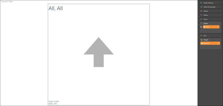
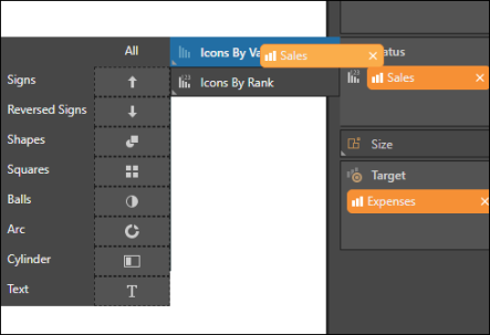
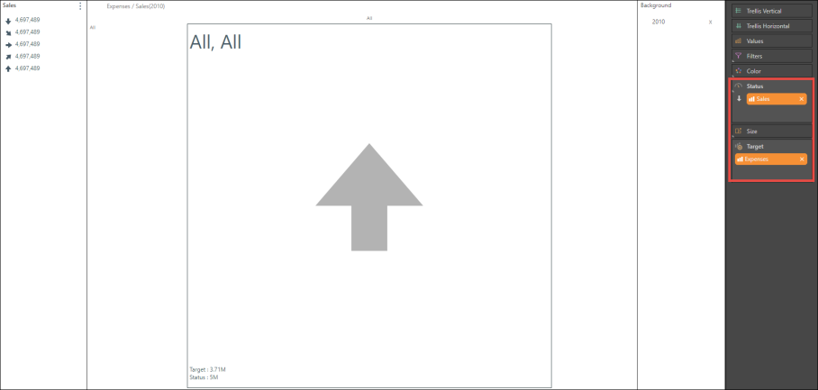
In this example, the gauge is measuring all Sales (the status value) against all Expenses (the target value). You can determine the type of status indicator, and the logic behind them, by dragging the chip over the Status header to open the Status submenus. For details, see KPI Status Indicators.
- When using arrow indicators, select Signs if you want the status value to be higher than the target value (for example, if you want a status value of Sales to exceed a target value of Costs)
- If you want the status value to be lower than the target value, then use Reversed Signs (for example, if your status value is returns, and the target it sales, then a low status value would indicate success).
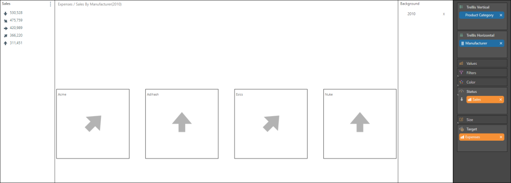
Now, the element 2010 is added to the query as a background filter, to compare Sales to Expenses during 2010:
Here, the gauge is trellised by the Manufacturer hierarchy , so that each gauge represents a different manufacturer:
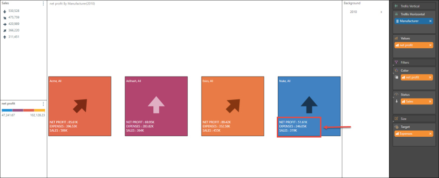
To add a color dimension to the gauge, Net Profit is added to Color. Labels are then added (red highlight) via the Edit Labels dialog.
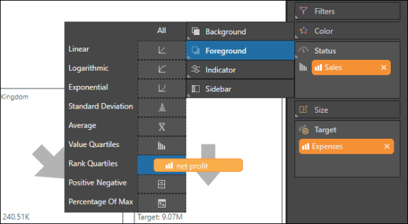
- When dragging a chip to the top of the Color zone, the various color indicator options will appear in the submenu
- You can add color to the background, the foreground (the text), the status indicator, or add a sidebar
- From the sub-submenu you can also determine the logic behind the color behavior. In this example, the color has been applied to the background, and it indicates rank quartiles for all measures in the query.
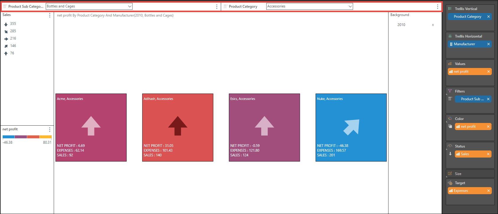
Continue adding measures and hierarchies or elements as required. Here, a cascading slicer (red highlight) has been added to enable filtering by Product Sub Category. Each gauge now represents a different manufacturer, comparing sales with expenses for the given product sub category, as well as net profit.